Episode 46 - What is this a map of?
New year, new tool! Our first episode of 2026 tells the story of how I built the Accessible Map Agent, a new way to make maps understandable for everyone.
Prologue
New year, new episode, new product!
I’ve been building things (mostly weird) for a while now. Everything from fantasy maps to arbiters to decide where we go for dinner to the Whisperframe that paints the vibe. These are fun, but mostly they are for me, and for storytelling with you. Today, that changes a little. 😉
Welcome to Episode 46, the first of 2026, where I tell you about building dymaptic’s Accessible Map Agent.
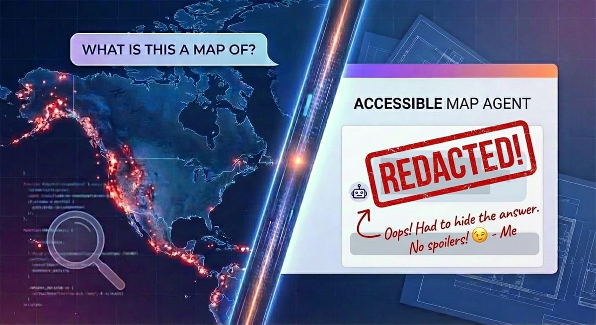
What is this a map of?
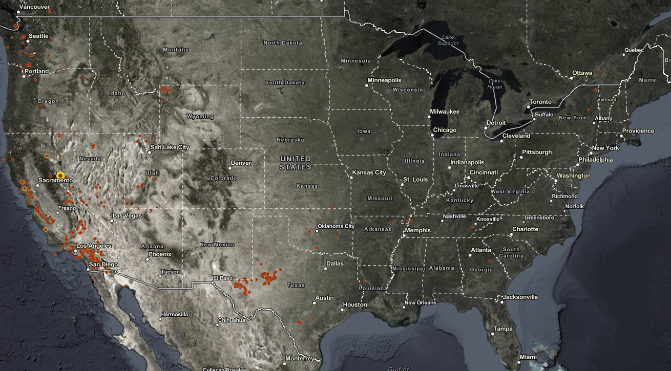
Take a good look at this map, lots of red dots in California, some in Texas, and even up in Seattle and Portland.
Go ahead, guess. I’ll wait!
You might look at this and make an educated guess about this being a map of wildfires. But it isn’t.
This is a map of recent earthquakes! Here is what the Accessible Map Agent had to say:
This map shows recent earthquake activity across the continental United States and portions of North America during the past 90 days, displaying earthquakes with magnitude 3.5 or greater. The continent-level view spans from the Pacific Coast to the Atlantic Coast, including parts of Canada and Mexico. The most striking pattern is the concentration of earthquake activity along the western coast of the United States, particularly in California, with scattered activity in the central and eastern regions.
Accessologue
So, what is the Accessible Map Agent?
Let’s start with why this idea came about. There is a new ADA deadline in April 2026 for state and local government websites to ensure that web content and mobile applications are accessible to people with disabilities. Maps are one of the most complex parts to get right and many organizations don’t even know that their webmaps are covered by these requirements.
The idea to build a tool to make maps more accessible came directly from one of our team members with ties to the disability community (She, Amara, literally co-founded a theater organization that performs shows exclusively in sign language).
Of course, unsurprisingly, I was excited for the challenge of building this. But what I didn’t expect was to find this tool useful for myself. I have found myself using this tool constantly to write map summaries, even though I can see just fine.
They say a picture is worth a thousand words. I say a map is worth a thousand pictures. But sometimes, a few, dinky, hundred words can make a map actually understandable. Good descriptions aren’t just for accessibility. They’re for comprehension. For that time when you are on a call with someone and they ask, “What am I looking at?” and you need a quick answer.
The Build
I prototyped the Accessible Map Agent a few months back, and did a lot of work on the secret sauce that makes this tool powerful. We’ve been using it with clients and maps for a while. By December, it was time to make this production-ready. That meant building everything else:
- ArcGIS Authentication
- Listing Maps
- Better UI
- Landing Pages
- Pricing
- Subscription management
- Colors
- Logos
- …
The actual core of the application was the easy part! You should expect this by now, but Claude Code built the entire application. I designed, guided, prompted, and tested, but I did not edit any of the code. I don’t really want to edit the code myself anymore. This suits me fine (but let’s not call it vibe coding, okay?).
After some back-and-forth, Claude picked the stack: Next.js with TypeScript, PostgreSQL, Tailwind CSS, Azure App Service, and ArcGIS OAuth for authentication. I built most of this iteratively, starting with a design document based on the prototype and extending it as I went. I had the end goal in my head and just kept pushing Claude along until we got there.
What Broke
Obviously, Claude got things wrong. The worst ones were: Email rendering and subscription management.
Here, Claude Code describes the Email rendering it worked through (yes, it wrote this):
Email rendering hell. I built nice CSS-styled buttons for our transactional emails. Looked great in my browser. Looked like garbage in actual email clients—text appearing above the button, outside the button, floating in space like it was trying to escape. Turns out email rendering is still stuck in 2005, and I had to rewrite everything using table-based "bulletproof button" markup. It's 2025 (well, 2026 now) and we're still writing HTML like it's the early internet. Email is where CSS goes to die.
The subscription management part was mainly on me. I tried to write it all down. I even worked with Claude (not the code variety) to work out the entire workflow, and we still struggled together to get it all right. This felt pretty normal, like working with any developer. The feedback loop was just waaaaaaaay faster!
The trick to getting through these was iteration (it doesn’t get everything right the first time, and that’s okay). For the Email problems, Claude mostly figured it out on its own once I showed it a screenshot and explained the issues with the text. It actually re-wrote part of the HTML, then said something like “Oh, I just realized this is for Email, and I should use a table-based layout, let me do that,” and succeeded in getting it done.
I had to intervene with subscription management. I started by providing a complete design document, but it ended up complicating things. I had to step in by feeding it smaller chunks of work and testing myself as we went. The first version (the one it built based only on the design document) worked, but was confusing. The second round turned out much better.
What worked well
Gissues. As we tested, other humans (or almost entirely humans) were able to submit bugs and things as gissues. Claude Code could pull them directly (using the GitHub CLI), ask me clarifying questions (as is my practice), and build fixes! This part of the workflow was really great for simple items that were clearly defined in the gissue. For more complex issues (hint: subscription management) that might have more nuance, well, that still took me testing and holding Claude’s … er… hand?
The polished thing you see at launch is still the result of a lot of “wait, why isn’t this working?” (and a lot of, “wait, why is this working?”).
Overall, I spent about 80 hours building the final product (not including Claude’s costs and time). It boggles my mind that I was able to build so quickly. What a world!
If you send me a note with your thoughts, I’ll add 20 bonus generations to your account.
Seriously. I want to know what works and what breaks!
Maps should be for everyone. Now they can be.
Circumnavigating Back (to the beginning of this episode)
A note on the earthquake map that I showed above. I admit I made this map extra hard. The original map had magnitude labels.
I showed Claude the labeled map and it correctly identified it as earthquakes. Without the labels, it claimed the “vibe” was earthquakes, but wasn’t sure. The Accessible Map Agent got it right on the first try!
That’s why the Accessibility Map Agent is so powerful; it goes beyond a screenshot of the map to help the AI understand the data and the purpose.
Newsologue
- “Slop” as in AI slop is the word of the year. Thanks Merriam Webster for always being on point. That is real appreciation, they have done funny things throughout the years!
- Both Anthropic (Claude) and OpenAI (ChatGPT) gave people double usage for the month of December. More than just a marketing gimmick, I bet hey are studying to see if they can handle the load, and if people even use the extra tokens!
- Somehow I missed this gem the other week where Disney made a deal with OpenAI to bring Disney characters to the Sora video generation platform. That can’t go wrong.
- AI has ruined the hiring process and apparently folks are turning to dating apps?

Weekend Project: Building a GIS Apparel Brand with Claude as CEO
Ever wonder what happens when you give an AI full autonomy over a business? I'm finding out in real-time.
This recently got a little love on LinkedIn!
(I'll write up the experience at some point. Spoiler: Claude is a demanding but effective boss.)
Epilogue
I wrote the Accessible Map Agent, using Claude Code. Then I brainstormed with my Claude writing agent about what to write. Claude made a draft, which I threw out, mostly, and then wrote this. I then got feedback from Claude, and Holly edited.
Claude came up with “Maps should be for everyone. Now they can be.” Which is a little on the nose, but the sentiment is right, so I went with it.
Happy New Year. Go describe a map.